
10 examples of online stores: design, UX and checkout

A good online store in 2026 does not sell on the basis of a beautiful first screen. It sells because it quickly leads a person from interest to purchase: it helps to find a product, understand the differences, check availability, choose delivery and pay without unnecessary steps.
That is why it is useful to look not just at “beautiful sites”, but at stores where the design, catalog, product card, shopping cart and integrations work as one system.
This article collects 10 examples of online store design: six strong global benchmarks and four NBM-IT cases. Analysis is needed not for the sake of inspiration in a vacuum, but to see specific solutions for the catalog, product card, filters, mobile version and checkout.
If you're currently planning a launch or redesign, it's helpful to check the bigger picture of the market first. We analyzed separately online shopping trends in 2026: AI selections, mobile checkout, integrations, personalization and speed requirements. And here we go more practical: we look at examples and immediately translate them into solutions for the project.
For business, this is not a “look at beautiful sites” article. This is a short map of what's worth putting into your online store development, so as not to redo the catalogue, filters, cards, payment, analytics and integrations later.
Quick choice: which example to look at for your task
| If you run | Look first | What to take into the project |
|---|---|---|
| Equipment store or B2B catalog | Apple Store, X-Case | Configurations, comparison, compatibility, quick search and filters |
| Fashion or lifestyle store | Nike, Lamoda, Chic Hair Shop | Scenario selections, sizes, mobile path to purchase, certificates |
| Furniture, home and renovation products | IKEA | Categories around the task, kits, sizes and availability |
| Beauty, wellness and products with selection by properties | Sephora, A2 Cosmetics | Card content, reviews, application scenarios and trust |
| Children's products and repeat purchase products | Online store for moms on Yii2 | Personal account, order history, bonuses and convenient catalog |
10 examples of online store design
Catalog, product cards, mobile UX and checkout: what to use in your project
1. Apple Store
A strong example of complex product cards: clear configurations, comparison of models, services and neat tips in the selection process.
2. Nike
A mobile-first scenario, strong selections, personalization and content around the product help quickly move from inspiration to purchase.
3. IKEA
An example of a catalog that sells not individual products, but scenarios: rooms, tasks, sizes, kits and compatible solutions.
4. Ozon
Useful as an example of a familiar mass scenario: quick search, filters, reviews, delivery and a clear personal account.
5. Lamoda
A good guide for categories where size, fit, photo on model, returns and quick selection of similar products are important.
6. Sephora
A strong example of how reviews, instructions, selections and content help you choose a product without consulting a manager.

7. X-Case
Catalog of accessories on 1C-Bitrix: filters, search, product card, simplified checkout and integration with 1C.
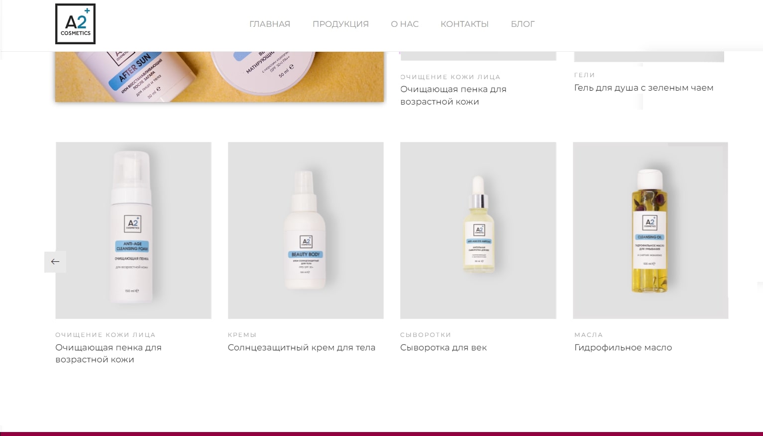
8. A2 Cosmetics
Online store of premium cosmetics: catalog, filters, cards, payment, delivery and SEO structure.
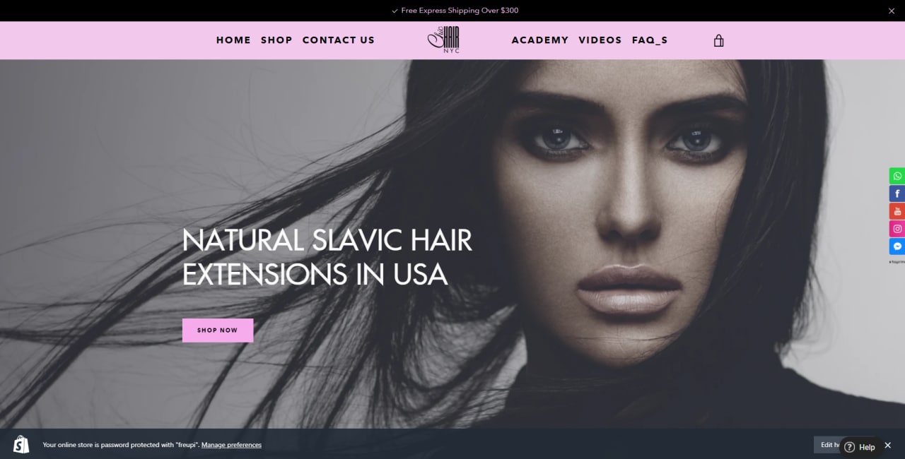
9. Chic Hair Shop
Custom Shopify theme for a hair products brand with gift certificates and email scripts.
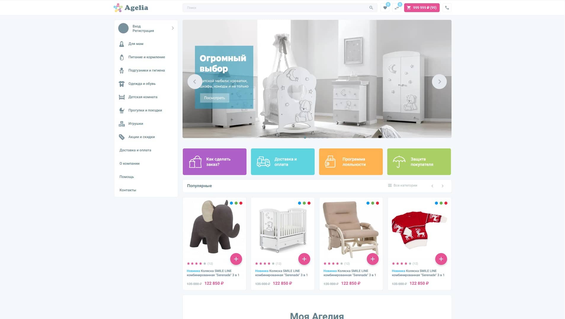
10. Online store for moms
A Yii2 store with a catalog, personal account, bonus program, delivery and repeat orders.
What unites strong online stores?
When you look at the best examples not as a designer, but as a business owner, it quickly becomes clear that a strong store doesn't try to surprise on every screen. It reduces friction.
The buyer must quickly understand:
- where is the required product?
- how one model differs from another;
- is the product in stock;
- when will it be delivered;
- how much will delivery cost;
- Is it possible to return a purchase?
- who to trust with payment;
- how to quickly place an order.
When these answers lie on the surface, the store begins to sell calmer and more stable. At the project stage, we usually fix this in a prototype: we separately design a catalog, product card, shopping cart, checkout, personal account and repeat purchase scenarios. If the store is needed not “as a showcase”, but as a working sales channel, it is better to immediately connect UX with web development, SEO structure, CRM and analytics.
1. Apple: the standard of a complex product card
Apple Store shows well how to sell a complex product without overload. The company has many devices, configurations, accessories and scenarios, but the selection path remains clear.
What to take:
- large visual blocks without unnecessary noise;
- simple comparison of models;
- clear configurations;
- neat tips during the selection process;
- a strong link between product and service cards.
For a hardware, furniture, equipment or B2B store, this is an important lesson: if the product is complex, the interface should explain, and not just show characteristics. In such projects, we often start not with a design, but with a selection map: what parameters really affect the purchase, what comparisons are needed, where a person will need advice and what requests should go to CRM.
2. Nike: personalization and mobile scenario
Nike strong not only visually. It has a well-organized selection logic: categories, selections, recommendations, filters, mobile navigation and branded content work together.
What can be applied:
- selections for use cases;
- strong photographs in real context;
- quick path from collection to product;
- recommendations of related products;
- emphasis on mobile experience.
For an online store of clothing, shoes, sports or lifestyle goods, this is especially important: a person often buys not just a product, but an image, a task or a situation.
3. IKEA: a catalog that helps you think in rooms
IKEA good because it sells scripts rather than individual items. The user can go by room, task, budget, size or specific product.
What's worth a peek:
- categories gathered around life scenarios;
- room ideas and selections;
- product compatibility;
- clear sizes and materials;
- connection of cards with delivery and availability.
For furniture, renovation, decor and home goods stores, this is one of the most useful approaches. People often don’t know the exact model, but they know the task: “you need a table for a small kitchen” or “a cabinet in the hallway that goes up to the ceiling.”
4. Ozon: quick search and familiar purchasing logic
Ozon It cannot be judged only as a “beautiful” store. Its strength is in the speed of the script: search, filters, cards, reviews, delivery, pick-up points and the usual cart.
What's important:
- search with hints;
- filters for different categories;
- reviews and questions;
- transparent delivery;
- fast re-order;
- clear personal account.
A small online store does not need to copy the entire marketplace. But it’s worth adopting the user’s expectations: quick search, clear conditions, order status and a minimum of surprises in the cart. If the store is already growing, the question of integrations quickly arises: CRM, warehouse, 1C, delivery, payment, order statuses and notifications. It's better to design with CRM development, and not screw it on randomly after launch.
5. Lamoda: filters, sizes and trust
Lamoda - a good example for fashion e-commerce. In clothing and shoes, the buyer is afraid of making a mistake with the size, fit, return and delivery. Therefore, the interface should reduce these doubts.
What works:
- noticeable filters by size, brand, color and price;
- photo of the product on the model;
- clear return information;
- reviews and ratings;
- selection of similar products;
- quick repurchase scenarios.
For niches where it is important “whether it’s suitable or not”, the product card should be almost a consultant.
6. Sephora: content, reviews and selection without a consultant
Sephora shows well how content helps sell. In the beauty segment, a person cares about composition, shade, effect, reviews, instructions and comparison.
What to take:
- detailed cards;
- reviews with details;
- guides to choose from;
- selections by task;
- content around the product;
- recommendations for related products.
For cosmetics, health, children's products, technology and any products with a lot of questions, content reduces the burden on managers and increases trust.
7. X-Case: a complex product that needs to be explained quickly
NBM case X-Case shows how to organize a smartphone accessories store around quick selection. The project includes a catalog, filtering by parameters, a card with characteristics and compatibility, a simplified shopping cart and integration with 1C.
What to take:
- filters that respond to real choice parameters: device model, brand, color, price;
- search with hints for a wide catalog;
- product card with characteristics, photos, reviews and similar items;
- checkout without mandatory registration;
- SEO structure of categories and products before launch.
This is a good reference for technology, accessories, spare parts, equipment and B2B catalogs. When the assortment is large, it is more important for the buyer to quickly narrow down the choice than to see another banner on the main page.
8. A2 Cosmetics: a beauty store where trust and visuals are important
NBM case A2 Cosmetics useful for cosmetics, care, wellness and other categories where the buyer chooses with his eyes, but makes a decision through trust. In such projects, it is not enough to simply show the can or packaging. It is necessary to explain the effect, composition, application scenario, delivery format and the reason why the brand can be trusted.
What to take:
- clean visual presentation of the product;
- clear blocks of trust;
- emphasis on composition, effect and application scenario;
- convenient category structure;
- a neat combination of content and application.
For beauty e-commerce, this is especially important: the buyer cannot touch the product, so the site should replace part of the consultation and relieve anxiety before ordering. Such a store almost always benefits from content-rich landing pages, SEO categories, reviews, and clear conversion analytics. Therefore, beauty, fashion and lifestyle projects should be designed together with SEO promotion and web analytics, and not just with the designer.
9. Chic Hair Shop: Shopify store with gift scripts
NBM case Chic Hair Shop useful for brands where they buy not only a product, but also an occasion: a gift, care, repeat purchase or seasonal selection. An individual Shopify theme and gift certificate design script were created for the project.
What to take:
- individual visual presentation instead of a standard theme;
- clear categories and filters;
- mobile storefront without extra steps;
- gift scenario as a separate product route;
- automation of certificate issuance and email communications.
Gift and repeat scripts are useful not only in beauty. They work well in fashion, household goods, children's products, subscriptions and services where it is important to return to the client after the first purchase.
10. Online store for moms on Yii2: repeat purchases and personal account
NBM case online store for moms on Yii2 shows another important scenario: the assortment is wide, the purchase is repeated, and the client needs order history, delivery statuses, bonuses and clear navigation by age or type of product.
What to take:
- filters by age, brand, product type and price;
- personal account with order history;
- bonus program and clear conditions for re-purchase;
- a combination of catalogue, reviews, delivery and notifications;
- content SEO pages that help you choose a product without calling.
For children's products, FMCG, pet products and any categories with regular demand, the site should not only bring the first order, but also make the customer's return simple.
5 signs of an online store that will sell
A strong e-commerce project usually rests on five things.
The first is a quick search. If a person knows what he is looking for, he should find it in seconds.
The second is a clear product card. Price, availability, delivery, features, photos, reviews and returns should be close to the purchasing decision.
Third - a short checkout. If placing an order is similar to a questionnaire for accounting, some buyers simply will not make it to payment. The fewer extra steps, the better.
Fourth - mobile version. For many niches, the phone is already the main purchase screen, and not a fallback option. Therefore, the mobile scenario must be designed separately: menu, filters, card, cart, payment and quick re-order.
Fifth - integration. CRM, warehouse, 1C, payment, delivery, marketplaces and analytics must work together. Otherwise, the store quickly turns into manual labor. For such tasks NBM makes integrations and web services, connects CRM, sets up exchanges and helps build a normal operating system around sales.
Common mistakes when developing an online store
Mistake 1. Starting with design without designing the catalog. A beautiful layout will not save you if categories, filters and cards are assembled without logic.
Mistake 2. Doing checkout “like in CRM”. The buyer does not have to fill out fields that are only needed by internal managers.
Mistake 3. Hiding delivery and returns. The later a person finds out the conditions, the higher the chance that he will leave.
Mistake 4: Not thinking about SEO before launching. For an online store, the URL structure, categories, filters, breadcrumbs and micro-markup must be designed in advance. Otherwise, after the release, you have to rewrite the categories, close garbage pages from indexing and fix cannibalization.
Mistake 5. Leaving integration for later. If inventory, prices, and orders are updated manually, the store begins to break down as it grows. This is especially noticeable when a company enters marketplaces: the website, Ozon, Wildberries, warehouse and advertising begin to live in different versions of reality. For such scenarios, it is better to think ahead promotion and work with marketplaces.
Checklist before developing an online store
Before starting a project, you should answer the following questions:
- what categories will be the main ones;
- what filters the buyer really needs;
- which pages should be indexed;
- where the goods, prices and balances will come from;
- where will the order go;
- what payment and delivery methods are needed;
- whether integration with CRM or 1C is needed;
- what purchase scenario will be on the phone;
- what should be in the product card;
- how the store will measure conversion.
If these answers are not available, development almost always turns into rework. Therefore, before starting, we usually suggest not “immediately drawing the main one,” but going through a short pre-project: collecting requirements, defining an SEO structure, describing integrations, choosing a platform, and only then moving on to design and development.
When to contact the team
An online store can be put together quickly if you need a simple catalog and several dozen products. But if the project must grow, it is better not to skimp on architecture.
It makes sense to use NBM when:
- you need an online store with a catalog, filters, payment and delivery;
- the site must receive organic traffic from search;
- need integration with CRM, 1C, warehouse or external services;
- there is already a store, but applications are lost, checkout is inconvenient or SEO is not growing;
- you need to connect the website, marketplaces, advertising and analytics into one system;
- What is required is not a template showcase, but an e-commerce project for business processes.
Depending on the task, we can connect online store development, web development, SEO promotion, CRM development, web analytics and site support.
Conclusion
The best online stores in 2026 are distinguished not by the number of effects, but by the quality of the purchase scenario. They quickly show the desired product, explain the choice, speak honestly about delivery and do not torment the user at the payment stage.
For business, the main conclusion is simple: an online store must be designed as a sales system. It should have a catalog, UX, SEO, integrations, analytics, security and a convenient admin panel.
NBM develops online stores, catalogs, B2B portals and e-commerce systems with integrations with CRM, 1C, payment, delivery and analytics. If you are planning to launch or redesign a store, you should start not with the image of the main page, but with the catalog architecture, purchasing scenarios and integration map.
We can analyze your current store or the idea for a new project: what to leave, what to redo, which pages will give SEO traffic, where applications are lost and what integrations are needed so that the store does not rely on manual work.
Free project cost estimate
Answer 4 questions and we will send you a range of prices to suit your needs.